

A well-groomed website is an effective customer attraction tool in the digital age. Not only focusing on mass customer groups, The business also pays special attention to independent customers. So, Investing in every channel, every touchpoint to create a comprehensive experience for all user groups becomes a priority for brands, which includes website touch points.
However, According to survey conducted by WebAIM, space 98% Website homepages all have at least one error according to website building standards WCAG Website Accessibility Guidelines 2.0 (Web Content Accessibility Guidelines).
Below are some notes to help businesses optimize website interfaces to create user experience and increase conversion rates.
Cách kiểm tra tình trạng hiện tại của website
Before "embarking" on fixing the website design, Businesses can use the following tools and utilities to review the problems their website is facing::
- WAVE Web Accessibility Evaluation Tool
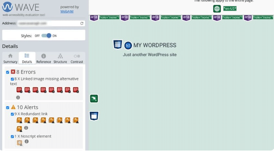
WAVE is an extension that helps programmers and businesses evaluate the accessibility of websites to users according to standards. WCAG Published by Chrome.
Detailed instructions on how to use the WAVE utility
In addition to reports of potential site errors and problems, WAVE also suggests to users ways to improve accessibility. For example, in the screenshot below, The extension has pointed out that some images are missing alt text (alternative text).
- ARIA DevTools
ARIA is a quite popular Chrome extension, allows designers to preview how the website browser will display to users, From there, customize how they interact with website content. Besides, ARIA created to improve the usability of websites for people with disabilities and make them more accessible with assistive technologies such as screen readers.
General introduction to ARIA DevTools (Accessible Rich Internet Applications)
To use ARIA, Users must install this extension from the Chrome Web Store, then select “Add to Chrome” and “Add extension”.
- Manual check
If you do not want to use support utilities, Website designers and businesses can evaluate their websites against standards WCAG 2.0 with 5 following question:
- Is the website content easy to read for all users??
- The image has full alt text (alternative text) Not yet?
- Does the site allow keyboard navigation??
- Does the audio and video files on the website have translations? (transcript) or annotation (captions) full?
- Does the contrast between the colors used highlight the content on the website??
However, Using the manual method will take more time than using online extensions.
Cách tăng trải nghiệm người dùng khi truy cập website
The key thing when website design is to be accessible and usable to everyone, including people with disabilities. So, Businesses should apply 5 rule below to ensure users have the best experience when using.
- Lưu ý về độ tương phản của màu sắc
Color is the first thing that impresses users when they visit a website. There are many principles of color combination in design, However, for websites, Designers should only use the maximum 3 color. Combining too many colors in a "greedy" way will distract visitors and make it difficult to focus on the main content..

Besides, Color contrast is an important factor when designing a website, Helps users distinguish content more easily. Good contrasting color pairs like white – black, yellow – black,… can make the content on the website stand out.
Standard contrast ratio of colors WCAG 2.0 with text usually 4.5:1. However, Depending on the size of the image and text, this ratio will change.
- Dùng thêm từ khóa và ký hiệu thay cho màu sắc
When performing operations on the website such as pressing an order button or switching pages, users with low vision or color blindness will not know what they are doing without keywords or symbols.
“King of streaming music online” Spotify also apply symbols to their designs. When the user clicks to repeat the song, The repeating icon will change from gray-white to green. However, so that color blind users can operate more conveniently, Spotify cleverly added a small dot below the repeat icon.
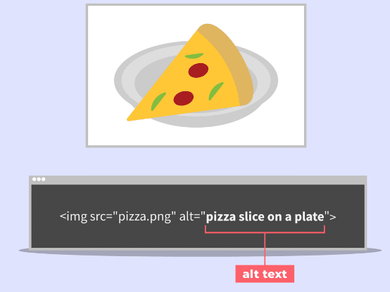
- Thêm văn bản thay thế cho hình ảnh
Alternative text (alternative text) also known as image description in HTML code. No matter what image is used, Web designers don't forget to add alt text. The original purpose of alt text was to describe images for blind people who cannot see them. These visitors may use a screen reader or a variety of browsers to help them better understand the content on the site., including images.
Instead of displaying the image to the user, Screen readers look at an image's alt text and read the image's content. So, users can understand what's on the image and get a better overall experience.

Besides optimizing images, The description also helps the website improve user experience (UX) and accessibility.
- Title hierarchy
Dividing content into small paragraphs will make it easier for visitors to read. Clear titles can help screen readers better understand and interpret them for visitors with disabilities, At the same time, it supports navigation within the page. WordPress recommend that web designers use the built-in title hierarchy: Heading 1 (H1) for title, H2 and H3 for subsections respectively.

- Điều hướng bằng bàn phím
For all users, especially people with disabilities, A clear navigation system plays an important role. Make sure users can quickly find what they are looking for. By using the tab keys, Arrow up – down – left – right, space (space), Users with disabilities can perform actions on the website, such as clicking on links or filling out forms.
Theo Advertising
